
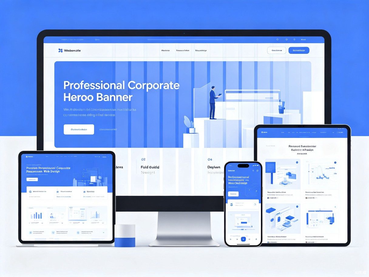
Responsive website construction
home > all services > Responsive website construction
Develop multi-terminal adaptation at one time

Responsive website construction

Responsive websites are developed once and are perfectly adapted to multiple ends, ensuring that your website presents the best visual effects and user experience on all devices, including desktop computers, tablets and mobile phones. One set of code, full-end coverage, efficient maintenance.
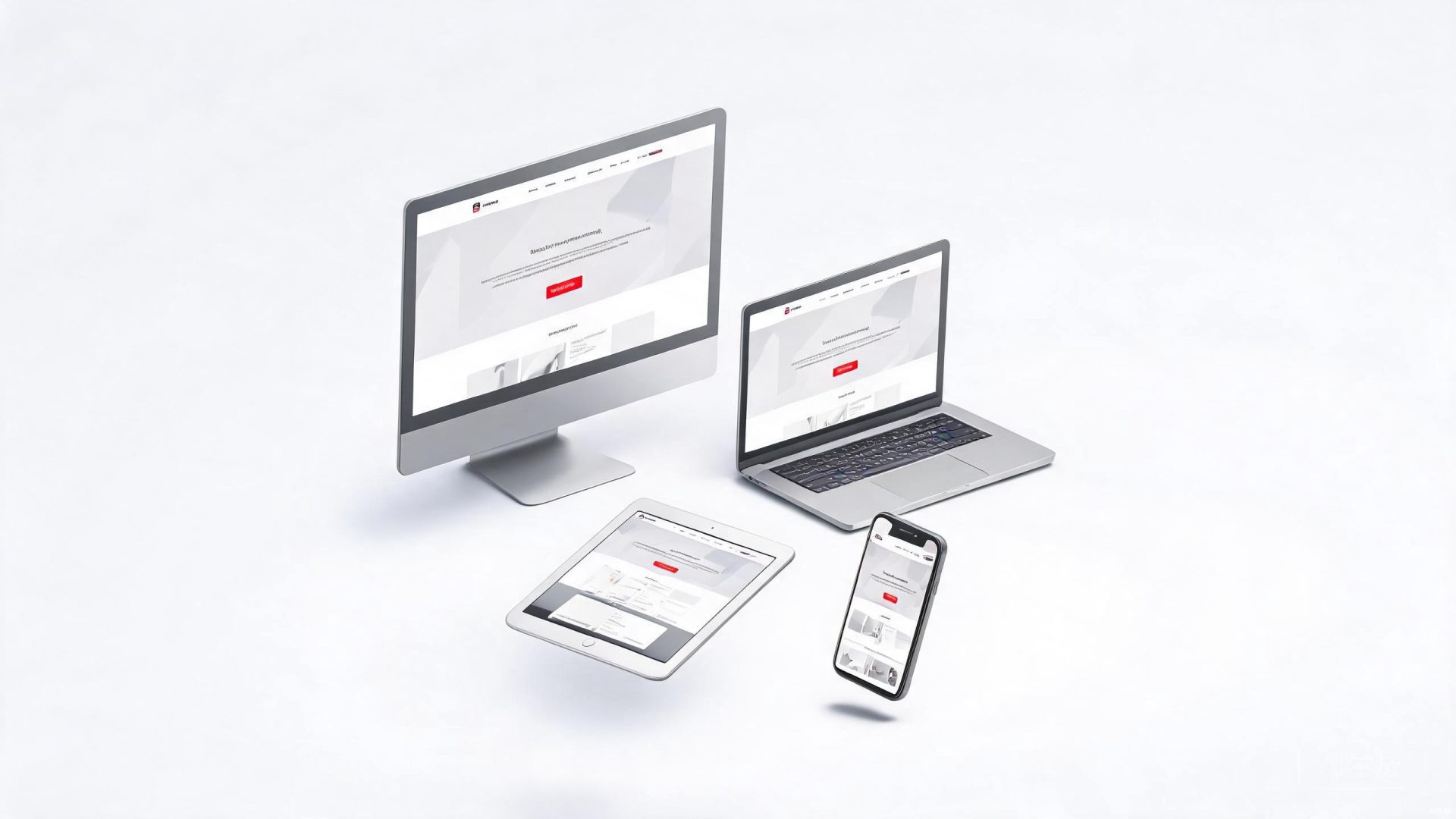
Multi-Device

Perfect fit on three sides

The same set of websites can present the best browsing experience on desktop, tablet, and mobile phones

desktop1920px / 1366px
flat end768px / 1024px
mobile phone side375px / 414px

What is responsive design

Responsive Web Design is a design method that allows websites to automatically identify the screen size of the accessing device and intelligently adjust the page layout, picture size and text size to provide the best browsing experience.

This means that whether users use a large-screen desktop display, iPad tablet or iPhone to access your website, they can get a perfect experience optimized for that device without having to maintain multiple separate versions.

  • Full coverage of one set of codes -- 无需为不同设备单独开发网站,大幅降低开发和维护成本
  • SEO-friendly unified entrance -- 搜索引擎只需索引一个 URL,集中网站权重,提升搜索排名
  • Future-oriented scalability -- 新设备出现时自动适配,无需额外开发和适配工作
  • Unified data management -- content 、用户数据和 analytics 统一管理,避免多版本数据碎片化
Responsive website multi-device display
Advantages

Core advantages of responsive design

Why more than 80% of businesses choose responsive websites as their preferred solution

01

reduce development costs

Just develop one website to cover all devices. Compared with developing two independent versions of PC station + mobile station, development costs can be reduced by 40%-60%, and maintenance costs are greatly reduced.

02

Improve SEO effectiveness

Google clearly recommends responsive design. A single URL and the same HTML code are conducive to search engine crawling and indexing, avoiding duplication of content and improving overall search ranking.

03

enhance the user experience

No matter what device users access on, they can get a layout and interactive experience optimized for the device, significantly reducing the bounce rate and improving user satisfaction and stay time.

04

Streamline operations management

Content updates only need to be released once and take effect simultaneously on all devices. The unified CMS management backend makes content operations more efficient and convenient, and significantly reduces labor costs.

Industry Scenarios

industry application scenarios

Responsive websites are suitable for all industries and meet the multi-end display needs of different industries

e-commerce Retail industry

Consumers browse products on their mobile phones, compare details on their tablets, and complete orders on their computers. Responsive design ensures that the shopping process is smooth and unobstructed on any device.

  • Product list Adaptive grid layout
  • Shopping cart synchronization across devices
  • Full optimization of payment process

education and training industry

Students use fragmented time to learn courses on their mobile phones, do homework on their tablets, and participate in live courses on their computers. Responsive learning platforms make education ubiquitous.

  • Adaptive playback of video courses
  • Job submission is multi-terminal compatible
  • Optimization of online exam interface

Real estate construction industry

Buyers use their mobile phones to check project information when going out to inspect the house, and use their computers to browse a 360-degree panoramic view of the house after returning home. Responsive official website allows real estate marketing to reach at any time.

  • Adaptive display of real estate information
  • Panoramic viewing and touch optimization
  • Make an appointment to see a house with one click
Technology Standards

Responsive technical standards

We use the industry's most cutting-edge responsive technology stack to ensure that our website performs at its best on every device

Flexbox

Elastic box layout

CSS Flexbox provides powerful one-dimensional layout capabilities, allowing elements within a container to flexibly allocate space and align. It is the core layout solution for responsive navigation bars, card lists and other components.

CSS Grid

Grid layout system

CSS Grid provides powerful two-dimensional layout capabilities, making complex page layouts concise and elegant. From the overall framework of the entire page to the card grid, Grid can efficiently implement adaptive layout.

Media Query

Media query breakpoint

Through CSS media queries to accurately control the style expression under different screen size, we have defined a scientific breakpoint system (mobile/tablet/desktop) to ensure that each device has an optimal layout.

Create a responsive website that is fully adapted

One-time investment, full-end coverage. Let your brand shine on every screen. We provide professional and responsive website construction services, from design to development, to ensure that every detail is perfectly adapted.

Hotline:175-3037-1114
Business Email:service@cheimc.com
Working hours: Monday to Friday 9:00-18:00

Get a free quote

home
service
telephone consultation
case
advisory
Contact us
enterprise WeChat
Enterprise WeChat·Exclusive consultant 1 to 1
Weixin Official Accounts·Follow for the latest information
QR code to be uploaded
Douyin·Pay attention to wonderful video content
QR code to be uploaded
Xiaohongshu·View customer case sharing
QR code to be uploaded
telephone consultation free plan
official store
cancel
Enterprise WeChat QR Code
Enterprise WeChat consultation
Scan code to add exclusive consultants